Gap/Perception Plot - Details
In a Side-By-Side Matrix question, the Gap/Perception Plot can be used to visually represent all the analytical data in one single chart. The details of one dimension (Importance etc.) is plotted on the Y axis and the details of the second dimension is plotted on the X axis.
How do I access the Gap/Perception Plot?
-
Go to:
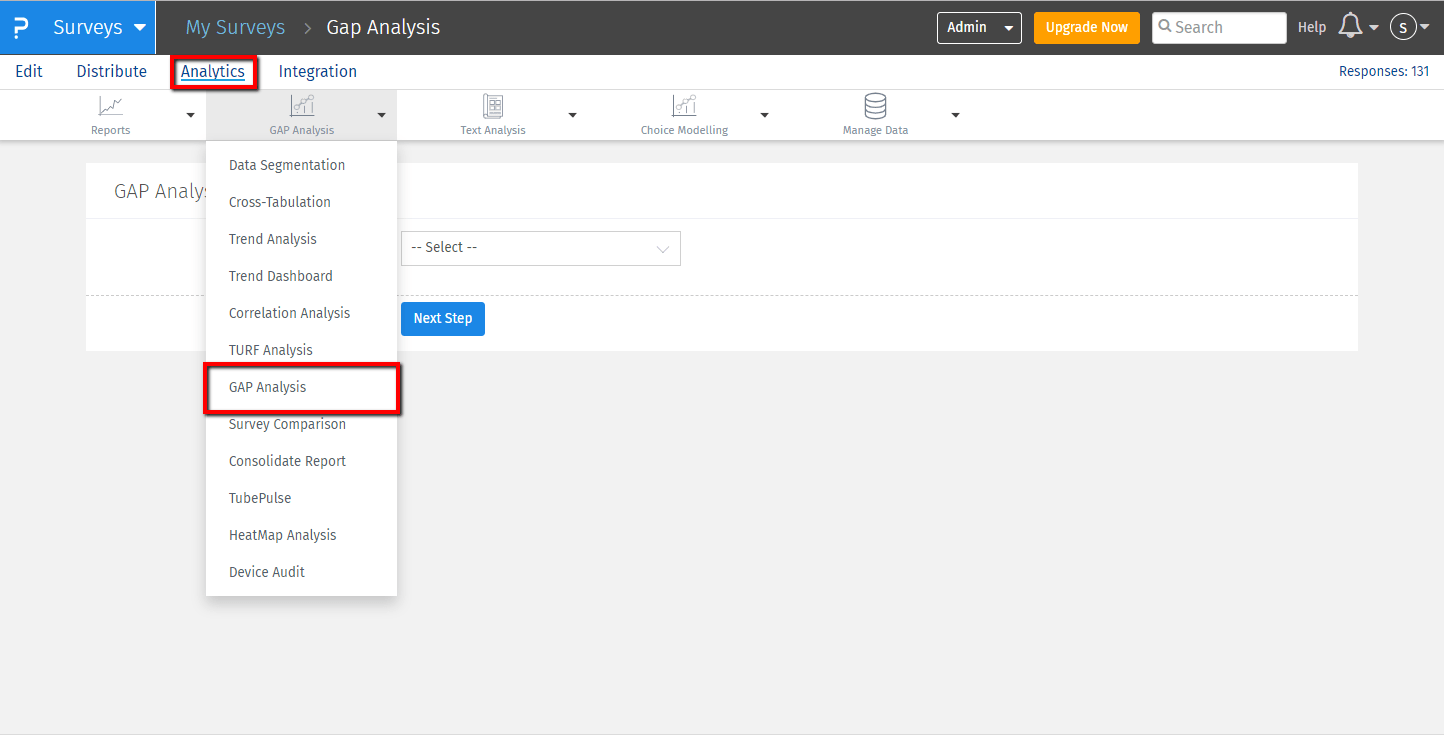
- Login » Surveys » Analytics » GAP Analysis
- Click on GAP Analysis
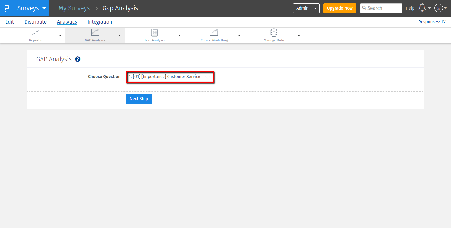
- Select the question to analyze from the drop-down menu available
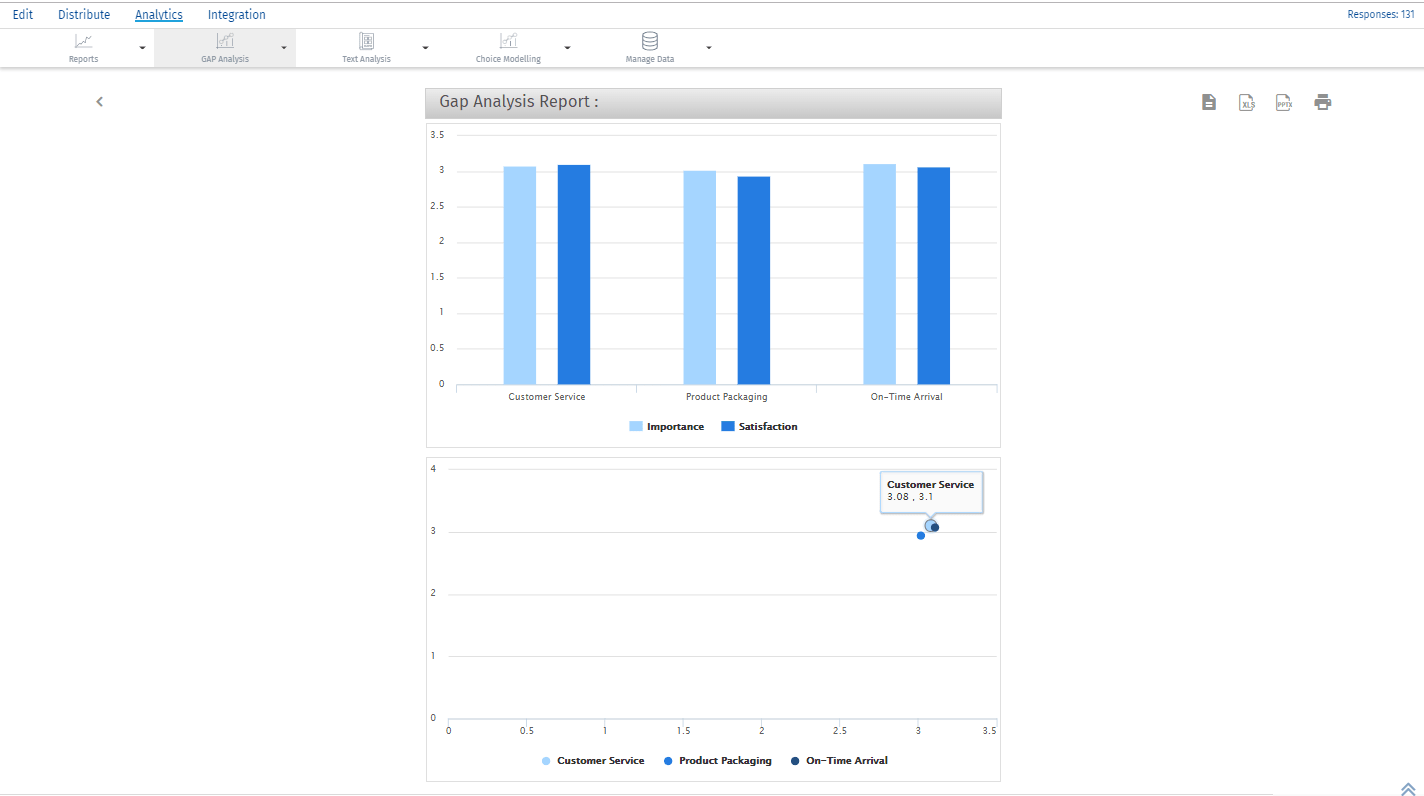
- Click on Next Step, and the GAP analysis charts will appear.
- You can obtain the online report or download the excel,ppt or print the results.


How do I read the charts?
The bar chart provides the mean for every dimension and the attribute. The plot is with respect to mean on the Y axis and atrributes like Customer Service, Product Packaginf and On-Time arrival on X - axis. Second chart is scatter plot that compares the dimensions based on the mean value of the attributes.
License
This feature is available with the following licenses :
GET STARTED WITH YOUR FIRST SURVEY NOW
SIGN UP FREEYou may also be interested in...
Side-By-Side Matrix Question
GAP Analysis - Introduction
Weighted Satisfaction Scoring
Gap/Perception Plot - Details

